Featured

My Passion in Art

Fundamentals of Communication Design

Be yourself; Everyone else is already taken.

— Oscar Wilde.

This is the first post on my new blog. I enjoy creating something fun and sometimes something personal. I want to expand my art into something that puts a smile on peoples’ faces. I love colors and making people smile, but I also like awareness of certain issues. 

Design Brief Project 3 Revised

1 What is your topic? 

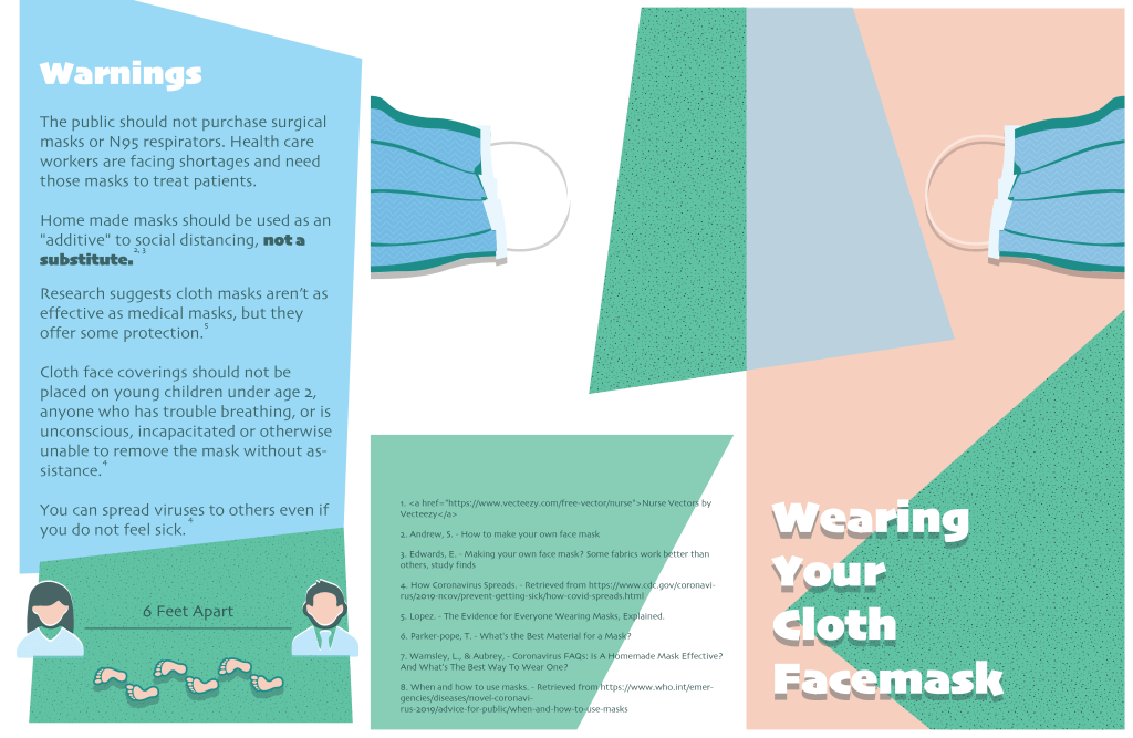
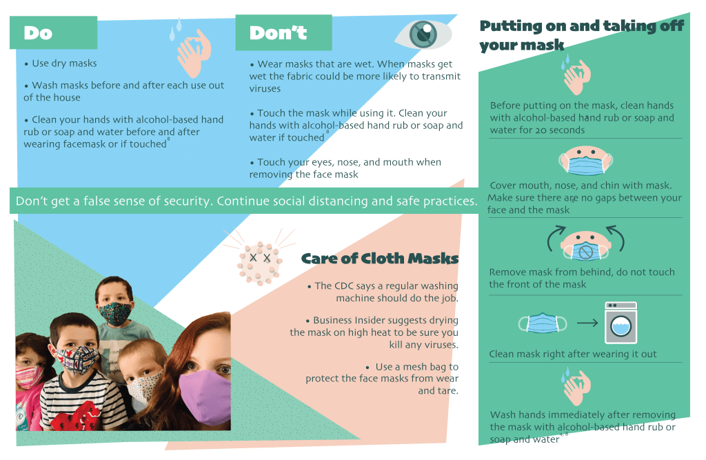
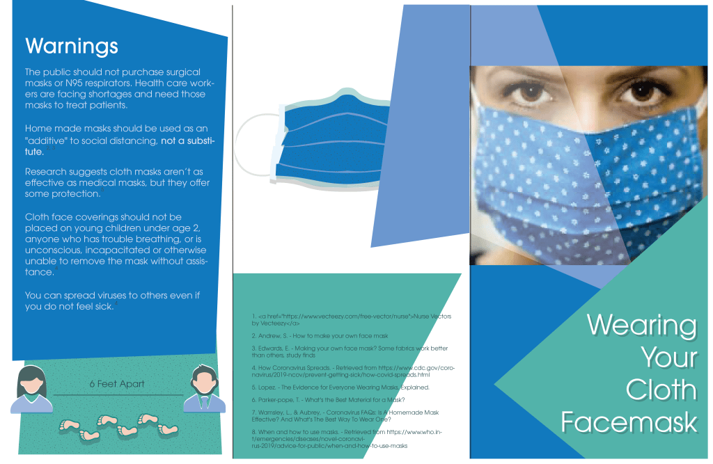
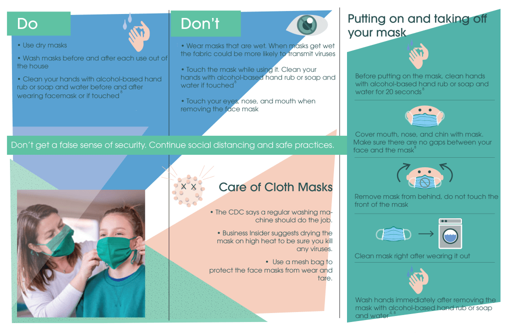
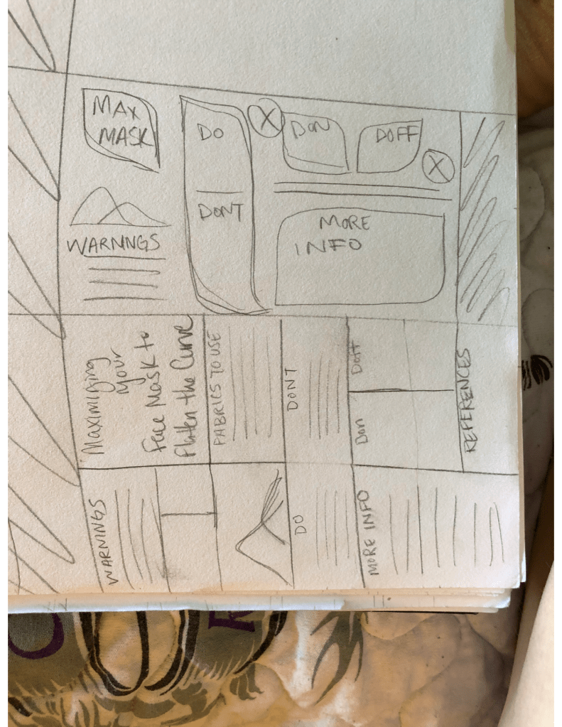
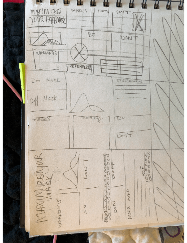
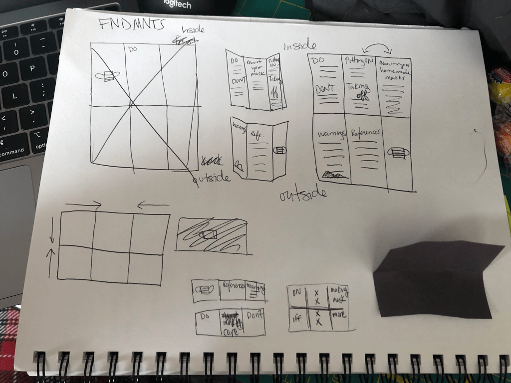
My topic is about the use of face masks

2 What is your interest in the chosen topic?

I enjoy anything health care related. I also can sew and wanted to make masks for people, so I was doing a lot of research already and decided, why not make an infographic so people are more informed.  

3 Who do you feel your audience might be?

Anyone curious in making face masks for themselves or others. 

4 What is your goal in presenting this information?

My goal is to inform people about the benefits and downfalls of making face masks and proper usage of cloth face masks, as well as information about the corona virus.

5 List a couple of your current research resources.

Andrew, S. (2020, April 4). How to make your own face mask. Retrieved from https://www.cnn.com/2020/04/04/health/how-to-make-your-own-mask-wellness-trnd/index.html

When and how to use masks. (n.d.). Retrieved April 5, 2020, from https://www.who.int/emergencies/diseases/novel-coronavirus-2019/advice-for-public/when-and-how-to-use-masks

Edwards, E. (2020, April 4). Making your own face mask? Some fabrics work better than others, study finds. Retrieved from https://www.nbcnews.com/health/health-news/making-your-own-face-mask-some-fabrics-work-better-others-n1175966

How Coronavirus Spreads. (2020, April 2). Retrieved from https://www.cdc.gov/coronavirus/2019-ncov/prevent-getting-sick/how-covid-spreads.html

Lopez. (2020, March 31). The evidence for everyone wearing masks, explained. Retrieved from https://www.vox.com/2020/3/31/21198132/coronavirus-covid-face-masks-n95-respirator-ppe-shortage

Wamsley, L., & Aubrey, A. (2020, April 3). Coronavirus FAQs: Is A Homemade Mask Effective? And What’s The Best Way To Wear One? Retrieved from https://www.npr.org/sections/goatsandsoda/2020/04/03/826996154/coronavirus-faqs-is-a-homemade-mask-effective-and-whats-the-best-way-to-wear-one

research topic: proper usage of cloth facemasks

research question: How can cloth facemasks help to flatten the curve?

conclusion statement: In conclusion, using good techniques and proper hygiene for your face mask can help flatten the curve.
Transparency, Modularity, Grid, Pattern, Diagram (pp. 154-231)

Transparency in design is used to create dense layered imagery with the use of colors and texture. Transparency allows for seeing through objects to view another object. Transparency can be used to mix two visual elements as well as make one image fade out against its background.

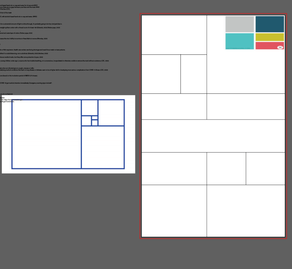
Modularity is a different kind of constraint. It’s a fixed element used within a larger system or structure. I think of it as working within a confined area, such as a grid.

A gris is a network of lines. Guidelines help designers align elements in relation to each other. Grids help with alignment and creating asymmetrical compositions rather than a static centered one. I love grids and need to build a folder with all the different grids to use.

Dots, stripes, and grids provide structure behind many designs. Patterns follow a repetitive principle. you can create patterns through shape and color. For modern graphic design purposes, though, I haven’t seen much pattern. I feel pattern takes dominance in fashion and interior design and art. I feel like pattern within functional graphic design (brochures, logos, etc) is very subtle and used as a transparent background. I think patterns are fun but can definitely be overwhelming and hard on the eyes especially when you’re trying to get a message across.

” A diagram is a graphic representation of a structure, situation, or process.” Diagrams allow us to see relationships and data that would be confusing if just presented in a list. It easier for our brains to process and understand. Graphs are easier understood visually using increments, intervals, size, change, colors, shapes. I think if you’re going to have a diagram you should also have a little map or guide to demonstrate what you are looking at, if it isn’t clear already. Diagrams can be used for fun illustration, but if there isn’t any context, I wouldn’t understand the importance of it and learning anything from it. But that’s just my science mind talking.

Texture, Color, Gestalt Principles (pp. 68-115)

In design texture can be both physical and virtual. It can be the physical surface or the optical appearance of that surface. Most designs are smooth, and the viewer doesn’t have the opportunity for feeling rough surfaces. I think most texture in design is visual where the piece just looks like it would feel a certain way. I think the examples in the book of texture through text is beautiful. Rough, fuzzy, bumpy. Text can create texture through color, stroke width, letterspacing, and paragraph leading.

Color can convey a mood. Happy, drab, glittering, mysterious. Color can connect items, differentiate items, highlight or hide items by using colors to make them stand out or disappear through camouflage. There is so much information with color. Color is used for everything and there are so many combinations and different hues, intensity, and saturation to create so many things. I love color! I feel like most designs now a days stick to a one-3 color scheme. Especially with logos, I feel like they are all so boring and plain. I would love to see more logos use more colors rather than just blue, or just green, or just red. I know it helps with branding and cost efficiency, but its just so boring! Also I still don’t understand Pantones and when and how to change them. That makes no sense to me.

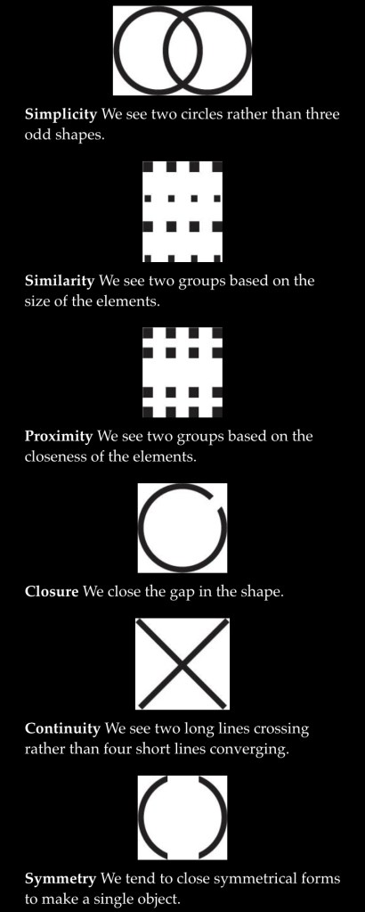
Gestalt Principles: “All things interact with other things.” Our brains like to build a coherent understanding of he works. So we like to simplify, categorize, and break down information that is coherent and understanding. So to make it easier for the viewer, designers separate forms from the space, color, or patterns that surround them to make visuals more comprehensible. Grouping also helps us to breakdown and categorize an image. Different types of grouping are simplicity, similarity, proximity, closure, continuity, and symmetry.

Framing, Hierarchy, Layers, (pp. 117-153)

Framing In Art: Brings attention to the art and sets it apart from its setting. Framing in Politics: Explaining an issue in terms that will influence hoe people will interpret it. Cropping borders, margins and captions are all ways we can frame a piece of art. Cropping an art piece can recreate different borders and alters the shape which can change the way in which we view it. Smaller margins can focus in on a subject, while larger margins can expand and make the piece feel bigger. Written language becomes a frame for an image rather than having open interpretation.

Hierarchy is the order of importance. I first learned about hierarchy in my art history class when we were talking about Egyptian art. Many of the times the Farro/Emperor was considered the most important subject in the piece and was created larger than the rest, and usually placed on top. The below sections were not of too much importance but created and built a story. In design, hierarchy creates structure and order. It is used to create “separation to signal a change from one level to another.” “The designer uses alignment, leading, indents, and type sizes and styles to construct a clear and descriptive hierarchy.”

Layer are the overlapping components of an image or sequence. One can use cut and paste to create layers. I think cut and paste is a really important feature in art. I think it creates shapes you wouldn’t normally create, as well as it allows for ease to move around into a composition that one enjoys snd is visually appealing. Layers are fun and can create a lot of movement in the piece.

Design a site like this with WordPress.com
Get started